España en Cifras, a data journalism project by Populate

El Español is a new digital-only newspaper, founded by Pedro J. Ramirez, one of the most renowned newspaper directors in Spain during the last 30 years. He has teamed with classics and young people (whom will surely will become classics), achieving a mix between old-school journalism and digital know-how (the co-founder’s blog, No Hace Falta Papel -Paper Is Not Needed- gives a good sense of their attitude).
Through Antonio Delgado, now Data Director at El Español, they asked us to help design and build España En Cifras to give context to the -then- upcoming municipal and regional elections (May ’15): a tool to give citizens a clear picture of how their village/town, province and region had evolved over the last 4 years.
The product
Imagine a dashboard with all the main indicators for your village (population, employment -and lack of-, GPD, debt, budget, household income…); a tool that would let you easily compare those metrics between different dates to check how they have evolved; and some graphs and maps to give context and provide different perspectives to contribute to understanding the information.
This is what we aimed to build.
(But wait, shouldn’t this already exist? Truth be told, all that data is already there, open and public, but it is scattered among many different websites from public organizations, who are responsible for each piece of information. And the information usually lies hidden in complex Excel files, not suited for straightforward public consumption. On the other hand, the official statistics spanish organization, INE, have many of them, but with an interface thought of as more for professionals than regular users.
How it is that I have a much better interface for my home scale than for my city budget is an issue we can discuss another day…)
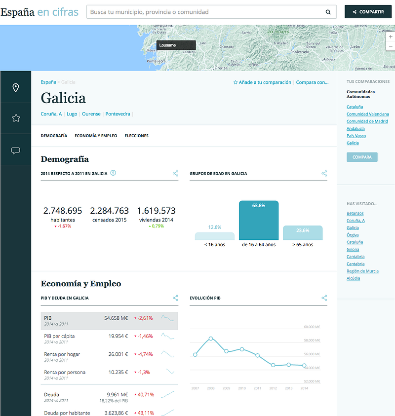
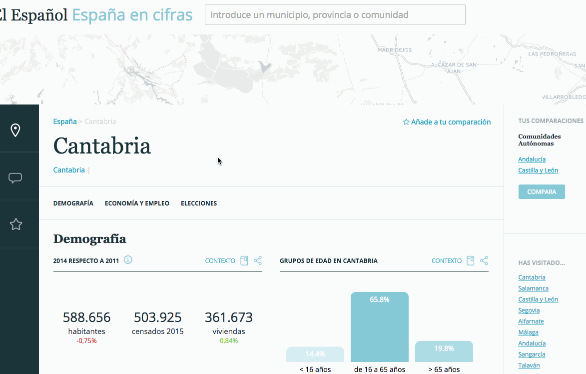
We focused on the three administrative levels, relevant for places’ discovery and information structure: Regions (“Autonomous Community” in spanish), Provinces, and Municipalities. Inside a specific location, we defined three main categories to group indicators: Demography; Economy and Employment; and Elections = Who lives here and “how” they are (age, houses…); how much are people earning, how much public debt exists, how much unemployment…; and who is governing here.
And for all of them, how they have evolved over the last years.
Starting from a place page, defining what should we include and how we should structure it, we continued defining the navigation between pages.
We created a grid-like structure that could accommodate cards with different content: plain data tables, graphs, and other visualizations. This gave the needed flexibility to show different indicators for each administrative level, since some indicators don’t exist for municipalities, for example.
Data sources, gathering and archiving
More than 85 different datasets are being used to produce this project, which are indexed into an Elastic Search. The data workflow included two main steps:
- Datasets are downloaded from the original source to a Dropbox shared folder. They are processed, where needed, to clean them up (in Excel), and then they are converted to CSV.
- For each file, a manifest is defined to transform the specific CSV format to the format we are using in our backend.
(We’ll write another more technical post to describe how we are storing the data.)
As you can see, this process is manual. Future improvements may include the creation of bots that automatically download, process and index a data source when it is updated.
Little navigation aids
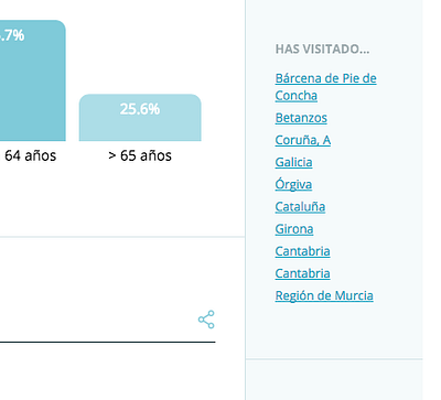
There are more than 8,000 municipalities in Spain, along with 52 provinces and 17 autonomous communities. That makes for a lot of pages you could eventually visit. The app will save your last visited pages, so you have them ready at the sidebar, enabling you to quickly switch places and go back to places you visited recently, in case you want to compare.
Others way of browsing include the top map; the search bar, which will autocomplete as you type (at lighting fast speed); and the sidebar, which will list the top-level places, so you can tree-browse.
Providing context: comparing tools
Aside from checking indicators for a place and seeing the evolution over time, comparing different municipalities or regions and how they have evolved, was an obvious use case. So we created some basic tools to make this easy.
You can add a place to your comparison list, and when you have several places listed, you can just click on them to compare:
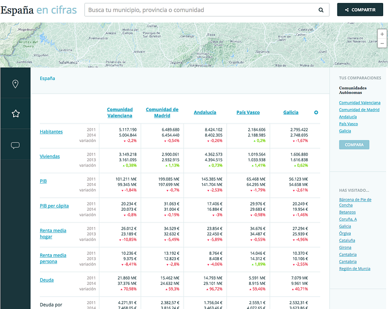
You will get a table with all the indicators and the places you are comparing, showing the values and % change. From here, you can remove or add other places to the comparison.
Furthermore, you can “pivot” over an indicator, and you will be shown this indicator for all the places.
Maps
Being that this project is about physical places, maps had to be an essential element. We used them to create some introductory visualizations for the home page, on which we gave high level context of the most important things that have happened in the last 4 years. If you click on the map, on a place page, the map will expand, and you’ll be able to browse to a specific municipality.

We also used them in the header of each place page, serving three functions: informational (giving context of the place you were seeing), decorative, and navigational (you can click anywhere in the map to browse to that place page).
(We’d love to have used maps for many more things, but see the last section of this post…)
Data as independent units
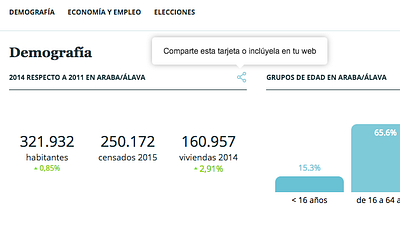
We like to think of data as independent content units that just happen to live in different contexts. One context is the place page, where we are mixing lots of indicators. But we may want to publish a story just about one issue. We built a very basic version of card sharing, being able to share a card in social media or get an embed code to include a specific indicator (or graph) in any web page.
This takes us to a lot of ideas we’d love to explore in the future: providing data tools to the newsroom so journalists go from working in siloed Excel files to shared structured data repositories that are shared and continuously updated, and allows to build dynamic tables, graphs and visualizations which are included in news pieces (things that are already being built in other newsrooms around the world: check ChartBuilder by Quartz and the experience of The Globe and Mail).
The team
Populate is a recently created studio to build tools for civic engagement, founded by Fernando Blat and Álvaro Ortiz.
In this project we teamed up with Antonio Delgado and Patricia López (now working at El Español), and Beatriz Martínez, visualization expert.
About Populate
At Populate we conceptualize, design and build products for civic engagement: Tools and platforms that enable citizens and organizations to better understand and interact with the world around us.
Ping us if you want to talk about interesting projects.
In the next installment, we’ll talk about the most technical foundations of the project. Follow us to receive the news.